Hi,
I’m Alessio Maffeis.
I love building teams and products

Passionate about product design, engineering, and leadership.
I like seeing the bigger picture and putting details into perspective.

Latest

Wherefore art thou Macintosh?

The key to the Mac therefore becomes that which the iPad/iPhone isn’t: an indirect input device. The keyboard and mouse/trackpad are what define the Mac. The operating system, the apps, the UX, are all oriented around the indirect input method. The iPhone’s capacitive touch brought about the direct input method, a third pivot in input methods (first was…

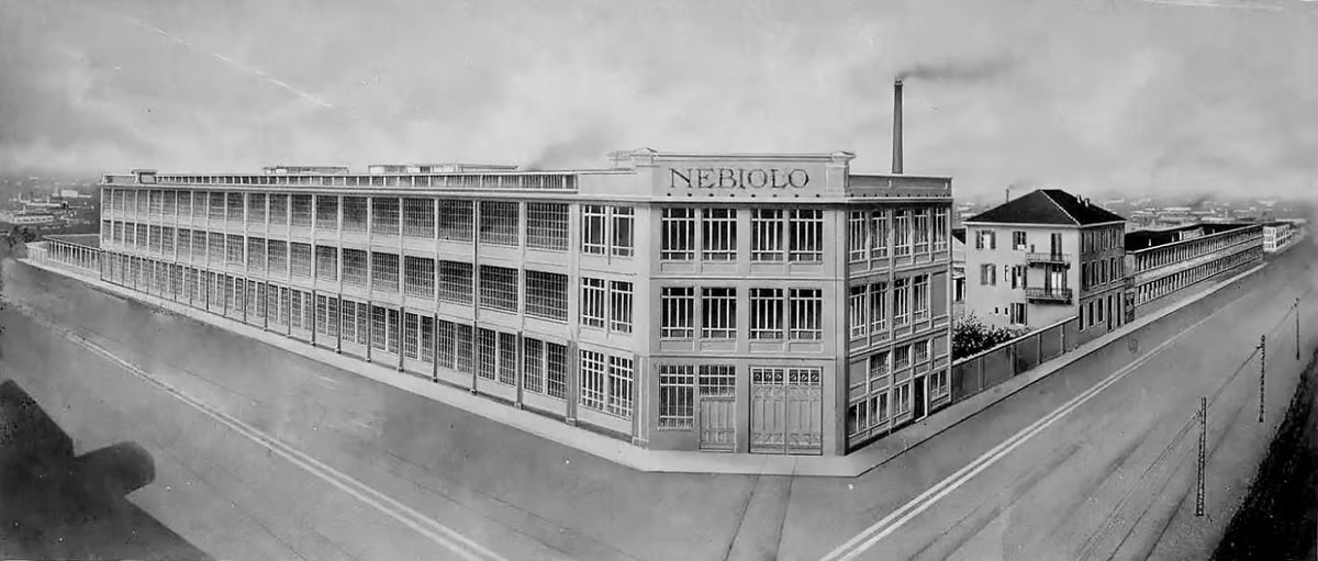
The story of Nebiolo

The Italian type foundry Nebiolo of Turin was the biggest type and printing equipment manufacturer in Italy. It started in 1852 and thrived in the first half of the 20th century, but never made the transition to phototype. The foundry closed in 1978.

Great profile of Nebiolo, one of the most influential type foundries in Italy. The text in the article was…

Why do we need new typefaces?

This is a perennial question from non-designers and folks who don’t use typefaces. They do, of course, need them on a daily basis. Modern life would grind to a halt if every typeface suddenly vanished overnight. Typefaces are so ingrained into our existence that it seems like they’ve always been there. It’s a “problem” that’s been “solved”. Most people…

Drowning the Crystal Goblet

Ty­pog­ra­phy is the vi­sual com­po­nent of the writ­ten word. But the con­verse is also true: with­out ty­pog­ra­phy, a text has no vi­sual char­ac­ter­is­tics. A gob­let can be in­vis­i­ble be­cause the wine is not. But text is al­ready in­vis­i­ble, so ty­pog­ra­phy can­not be. Rather than wine in a gob­let, a more apt par­al­lel might be he­lium in a…

The Birth And Death Of Privacy

If history is a guide, the costs and convenience of radical transparency will once again take us back to our roots as a species that could not even conceive of a world with privacy. It’s hard to know whether complete and utter transparency will realize a techno-utopia of a more honest and innovative future. But, given that privacy has only existed for a…

Design iterations

morning-boost
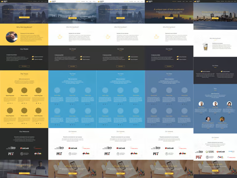
A visual history of the design process behind Morning Boost’s brand new website: morningboost.co.uk

As a project I worked on comes to life, I like to compile a snapshot of the key iterations that lead to its final, or better, initial form, in order to spot early mistakes and snatch unexpected insights. It’s like a near-death experience, but safer.

Tufte CSS

The web is not print. Webpages are not books. Therefore, the goal of Tufte CSS is not to say “websites should look like this interpretation of Tufte’s books” but rather “here are some techniques Tufte developed that we’ve found useful in print; maybe you can find a way to make them useful on the web”.

Agreed. I’ve always been fascinated with Edward Tufte’s…

On the importance of naming images

Naming artworks has always been important, not only because it’s useful to have a way to refer to the piece, but also, and much more importantly, to present a window to the creator’s vision and ideas, to clarify his intentions when creating the piece and to provide additional content to the visual. In ‘artistic’ photography it seems that the situation is…

Eurostile, the modern typeface

Eurostile in Mr. Robot

While watching Mr. Robot, Sam Esmail’s terrific new TV series, I couldn’t help but noticing a small detail from main character Elliot Alderson’s personal computer. I find it fascinating that in 2015 we still use Eurostile, the iconic typeface designed by Aldo Novarese in 1962 for the Turin based Nebiolo foundry, to convey modernity and technological edge. Not…

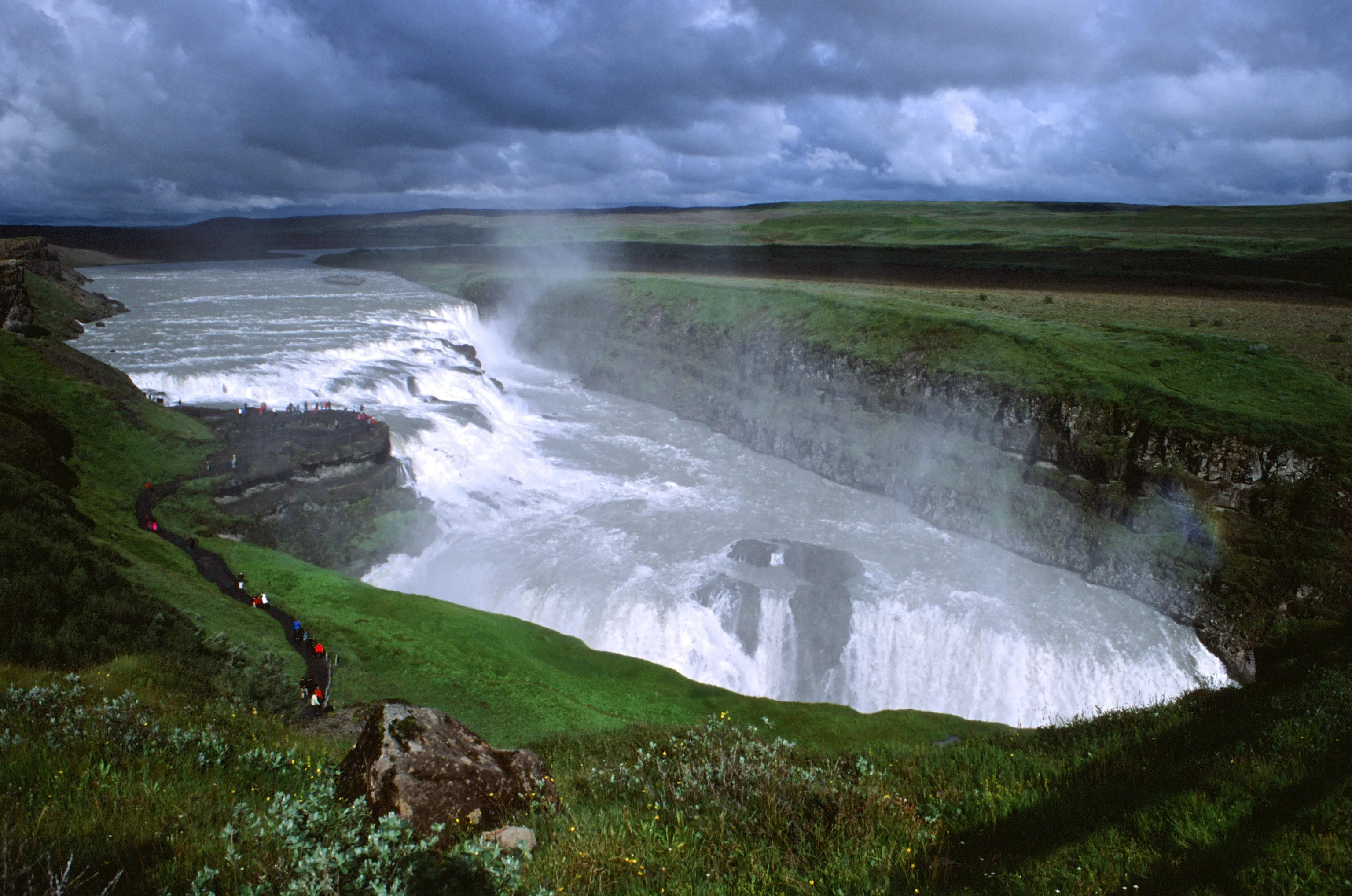
Iceland

Iceland

In motion

September 17, 2014

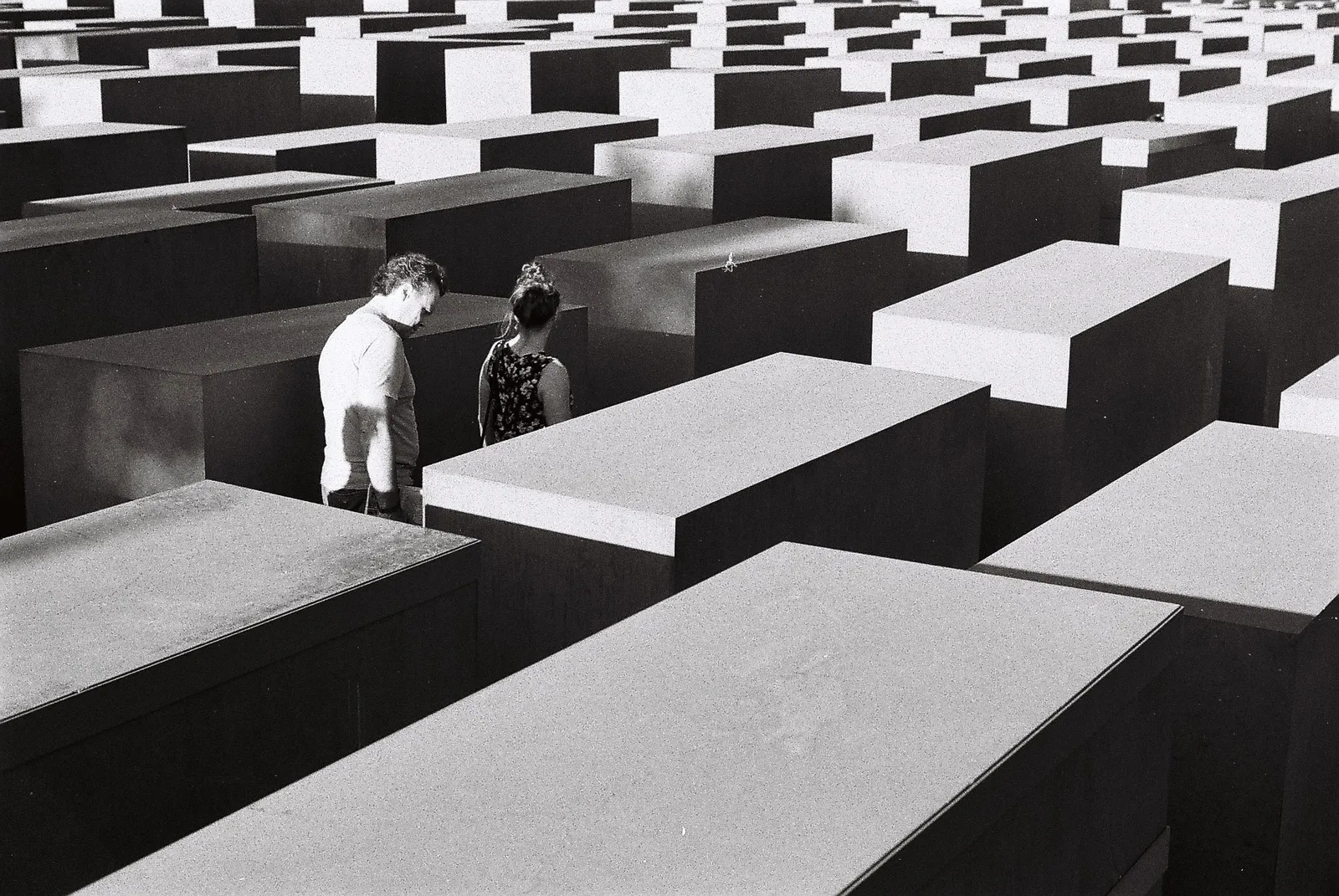
Berlin

Berlin

a short trip

December 29, 2013