Some bits about typography
The beginning of silent reading changed Westerners’ interior life
For centuries, Europeans who could read did so aloud. The ancient Greeks read their texts aloud. So did the monks of Europe’s dark ages. But by the 17th century, reading society in Europe had changed drastically. Text technologies, like moveable type, and the rise of vernacular writing helped usher in the practice we cherish today: taking in words without saying them aloud, letting them build a world in our heads.
If a relatively small typographic advancement had such a profound impact on the way we construct reality, imagine what being constantly interconnected with every other individual in the world will mean for future generations.
via quartzy.qz.comThe Futures of Typography
via robinrendle.comTypesetting on the web has evolved from a quirky afterthought into an invaluable practice. Within a span of twenty years complex interfaces that adapt to their environment, as well as an overwhelming number of typefaces, have bloomed all around us. Likewise, using animations and transitions or balancing display text in conjunction with powerful OpenType features became not only possible but expected. So where do we go from here? What are the skills we need to contribute to the future of typography? And what do two ghostly figures from the 15th century have to do with that future?
The story of Nebiolo
The Italian type foundry Nebiolo of Turin was the biggest type and printing equipment manufacturer in Italy. It started in 1852 and thrived in the first half of the 20th century, but never made the transition to phototype. The foundry closed in 1978.
Great profile of Nebiolo, one of the most influential type foundries in Italy. The text in the article was aptly set in Forma, Nebiolo’s answer to Helvetica, designed by Aldo Novarese in 1968 and digitally revived by David Jonathan Ross.
via djr.typenetwork.comWhy do we need new typefaces?
This is a perennial question from non-designers and folks who don’t use typefaces. They do, of course, need them on a daily basis. Modern life would grind to a halt if every typeface suddenly vanished overnight. Typefaces are so ingrained into our existence that it seems like they’ve always been there. It’s a “problem” that’s been “solved”. Most people don’t see the typeface, not consciously anyway, they read the words. To notice the forms of the letters is a learned, higher-level process and largely unnecessary for daily life. If meaning and information have been sucessfully extracted from the words, conscious recognition of the typeface is unnecessary: any old typeface will do.
However, if this were strictly true, the purpose of typography would be to merely convey information, to crystallise spoken words into symbols. It would thus render people as simple automatons blithely absorbing data. Efficient, but utterly joyless. Our relationship to typography is like our relationship to food—we eat for pleasure, not simply for nutrition.
Delightful short piece about the meaning and purpose of typography by Klim Type Foundry.
via klim.co.nzArchivio Grafica Italiana
via archiviograficaitaliana.comArchivio Grafica Italiana is the first digital archive dedicated to the Italian graphic design heritage. A growing overview to spread and promote the culture of quality that distinguishes the Italian design tradition. From the greatest classics to the best contemporary projects, commissioned by Italian clients or made by Italian designers, to explore and discover the fundamental aesthetic and cultural contribution brought by the Italian graphic design all over the world.
Drowning the Crystal Goblet
Typography is the visual component of the written word. But the converse is also true: without typography, a text has no visual characteristics. A goblet can be invisible because the wine is not. But text is already invisible, so typography cannot be. Rather than wine in a goblet, a more apt parallel might be helium in a balloon: the balloon gives shape and visibility to something that otherwise cannot be seen.
Matthew Butterick on the false dichotomy of form and substance.
via practicaltypography.comTufte CSS
The web is not print. Webpages are not books. Therefore, the goal of Tufte CSS is not to say “websites should look like this interpretation of Tufte’s books” but rather “here are some techniques Tufte developed that we’ve found useful in print; maybe you can find a way to make them useful on the web”.
Agreed. I’ve always been fascinated with Edward Tufte’s distinctive typographic style, and this experiment is an interesting, web-focused interpretation of Tufte’s principles.
via edwardtufte.github.ioEurostile, the modern typeface
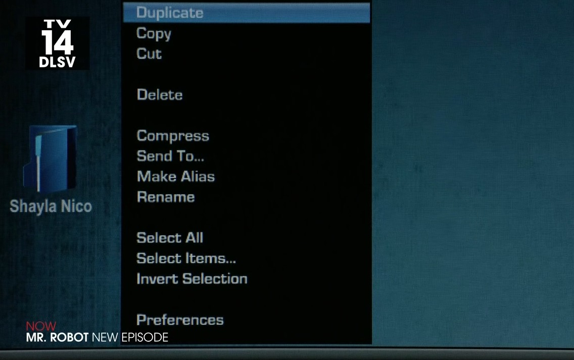
While watching Mr. Robot, Sam Esmail’s terrific new TV series, I couldn’t help but noticing a small detail from main character Elliot Alderson’s personal computer.
I find it fascinating that in 2015 we still use Eurostile, the iconic typeface designed by Aldo Novarese in 1962 for the Turin based Nebiolo foundry, to convey modernity and technological edge.
Not only Eurostile has stood the test of time, it still dictates time.